· Philippe Morin
The Secrets of Web Design: Influencing Time Perception

We’ve all waited impatiently for a web page to load, without having the slightest idea of how much time remains. Unfortunately, it is impossible to completely eliminate waiting time on websites or software. However, the way it is managed can greatly influence the user experience. We will see how to minimize these delays using various optimization techniques, but also change the perception of time by using appropriate indicators.
Decomposition of waiting time
Waiting time can be broken down into two distinct categories: reducible delays and irreducible delays.
- Reducible delays: Reducible delays involve all aspects of loading that can be minimized through optimization. The total loading time can be decreased, making websites and software faster. Different optimization techniques are presented below.
- Irreducible delays: Irreducible delays include those originating from external factors that cannot be eliminated. In other words, these are delays beyond our control, which cannot be resolved by any optimization. For example, this includes network latencies.
Reducing loading times
To decrease the loading times (reducible) of a website or software, there is no secret: optimization is key. Here are 4 simple tips to optimize a website or software regarding loading delays.
Lazy Loading: Lazy loading is a technique used to improve the speed of websites by delaying the loading of images and videos until they are actually needed. For example, if you visit a page with many images, those at the top of the page will be loaded first since they will be visible first. Other images will only load as you scroll down the page. This reduces the initial loading time of the page and saves bandwidth.
Using a cache: Using a cache makes websites faster and more responsive. By storing elements like images, style files, and scripts directly on the user’s computer, it avoids having to download them with each visit. This ensures that pages load more quickly, providing a smoother browsing experience.
File compression: Compressing files such as images and videos can significantly reduce their size. Naturally, the smaller the files, the faster they load. For images, using the WebP format, for example, can greatly help. According to Google, the size of lossless WebP images is 26% smaller than PNG images.
Caution with animations: Animations are great for enhancing and energizing a website, but they can also impact loading performance. It is important to limit animations to simple, smooth, and well-dosed animations to avoid overloading the page.
Managing Irreducible Delays
As discussed earlier, it is possible to reduce some waiting time through optimization, but what can be done about irreducible delays? Unfortunately, it is impossible to shorten these delays, but their impact on user experience can be minimized. The best strategy is using loading indicators. These positively influence user experience in several ways:
- Reducing anxiety: Loading indicators reassure users by showing that a process is ongoing and they just need to wait for it to finish.
- Managing expectations: Indicators such as loading bars are used to manage user expectations, providing a glimpse of the progress and an estimate of the time remaining.
- Reducing the perception of waiting time: Certain types of indicators give users the impression that the loading time is shorter than it actually is, as we will see with the loading bar.
Cyclic Indicators
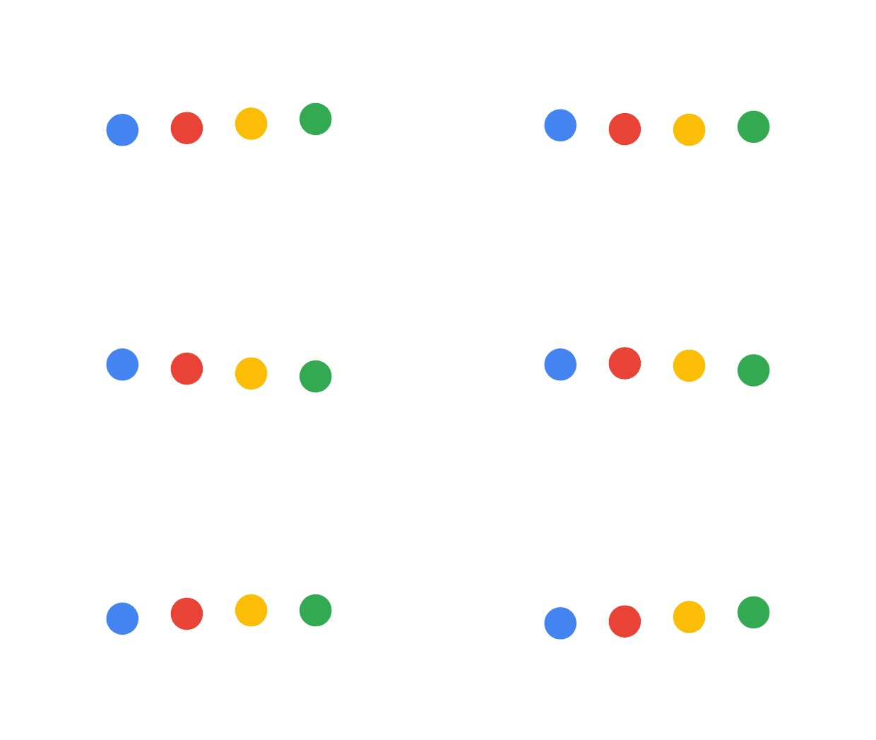
Cyclic indicators are simple animations that repeat indefinitely. For instance, this type of indicator is often seen when a website or mobile application is loading.


These indicators are used for loading times of a few seconds or less. Otherwise, they tend to irritate the user, which obviously goes against the primary goal of improving user experience. Apart from indicating content loading, this type of indicator does not provide any additional information.
Progress Indicators
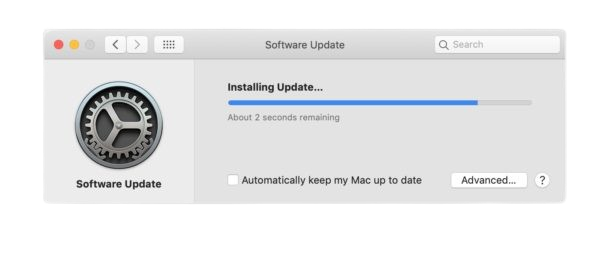
A loading bar is a visual indicator that shows the progress of an ongoing process. This indicator is used for longer loading times, such as a system update. It fills up gradually to indicate the advancement of the process and the time remaining.

A surprising fact about loading bars: they are sometimes faked! Indeed, in some cases, progress bars are deliberately manipulated to enhance the perception of speed. For example, the bar may advance quickly at first to reassure the user, then slow down towards the end, or follow a non-linear pattern to mask the actual time. Have you ever noticed a progress bar suddenly stuck at 99%?
Skeletons
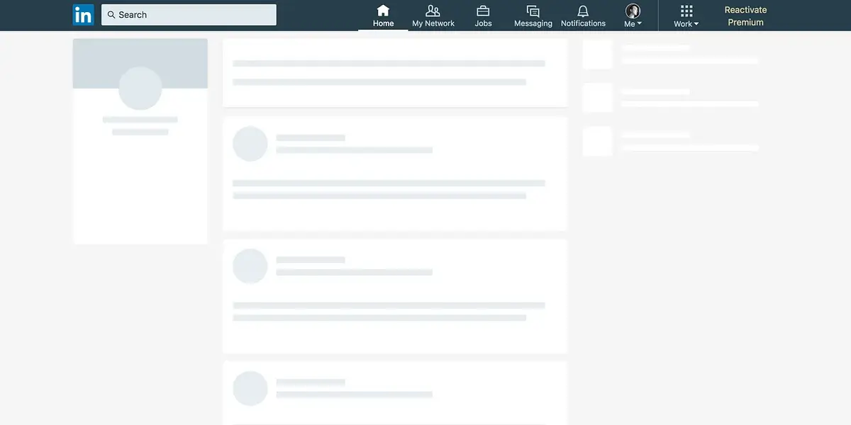
Skeletons present the structure of the page without its content during loading. They give an idea of the layout and appearance of the page once all the content is loaded. Most social networks use this technique, including Facebook, Instagram, YouTube, and LinkedIn to name a few.

This technique is very effective in reducing the perception of waiting time, as the user already has a concrete visual preview of the page.
Conclusion
Effectively managing waiting time on websites and software is crucial to providing an optimal user experience. While some delays are inevitable, it’s possible to use optimization techniques such as lazy loading, caching, file compression, and limiting animations to accelerate loading times. For irreducible waiting times, the use of loading indicators, such as cyclic indicators, progress indicators, and skeletons, helps improve the perception of waiting time. By combining these strategies, it is possible to create a smoother navigation experience and enhance the overall user experience.
Sources
- Progress Bars: mattmaldre.com
- Skeleton Screens: uxdesign.cc
- ux