· Philippe Morin
Designing for Impact: User Interface Principles for Web Development
Introduction
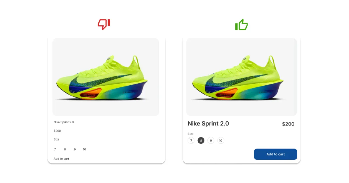
One of the main factors that differentiates a quality website from another is its user interface (UI). A well-designed interface allows users to take full advantage of a website’s features. It’s no surprise that industry giants like Apple, Google, and Facebook invest considerable resources to constantly improving their design. Better design translates to better user experience. We will examine four fundamental principles of user interface design aiming to transform a mediocre interface into an intuitive one.
Visual hierarchy
Visual hierarchy is an essential concept in user interface design. It refers to the arrangement and presentation of elements in a way that highlights their importance. Larger and darker elements grab users’ attention first, and should be used to highlight key information and elements.
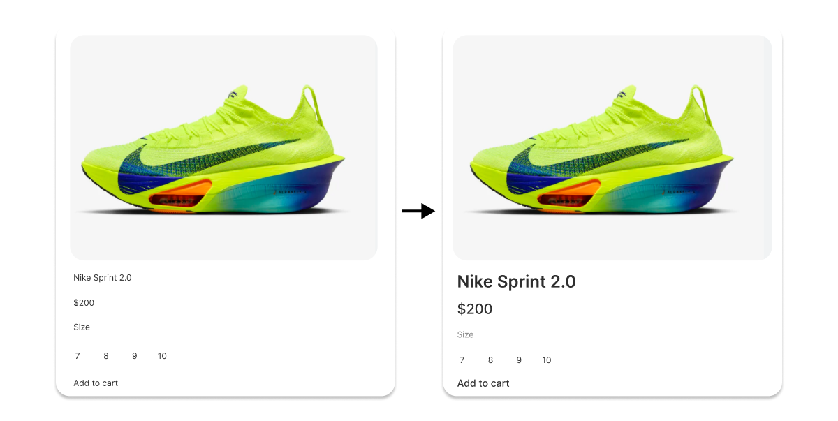
Here the model, price and add to cart button have been enlarged, as these are the most important elements for the user after the photo. The size label, on the other hand, has been changed to lessen its importance.
Use of space
Space utilization is an important aspect in user interface design. The closer the elements are, the more they demonstrate strong cohesion. This principle, known as the law of proximity, is important for organizing information and guiding the user’s attention.
Grouping related elements together allows the user to understand their relationship and how they work. Adequate spacing also helps distinguish different sections of the interface, making the user experience more intuitive. On the other hand, a lack of spacing makes the interface cluttered and difficult to navigate. It is therefore essential to find a balance to ensure optimal use of space.
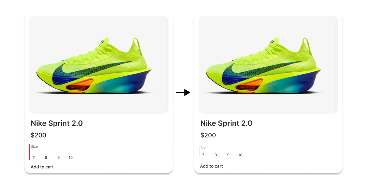
Here, the space between the size label and the available sizes has been reduced in order to emphasize their relationship since these elements are closely linked. In addition, the space between the size and the add to cart button has been increased in order to properly separate the concepts.
“Z” Shape Layout
The arrangement and organization of elements makes it easier for the user to understand the interface and it improves their experience by allowing them to navigate easily and efficiently.
The “Z” layout is a commonly used technique to guide the user’s eyes across the screen. It is inspired by the natural way of reading: left to right and top to bottom. Using this visual structure helps prioritize information, guide user attention and improve the overall user experience.
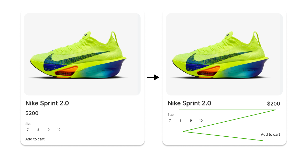
Here, the price and the add to cart button have been moved to respect the “Z” layout. The elements are placed in a specific order to ensure an optimal experience for the user. Typically, the user wants to know the product name and price before checking if his size is available. Once the size is selected, he will want to add the product to the basket.
Clearly identifiable interactive elements
The elements with which the user can interact must be easily identifiable. For example, a button should look like a button. This may seem obvious, but often, in an effort to create a unique and eye-catching design, we can forget this basic rule.
Users must be able to instantly identify which elements can be interacted with. This means that buttons, links, input fields and other interactive elements must stand out from the rest of the design. Using bright colors, shadows, distinctive shapes or animations are all good strategies for highlighting elements.
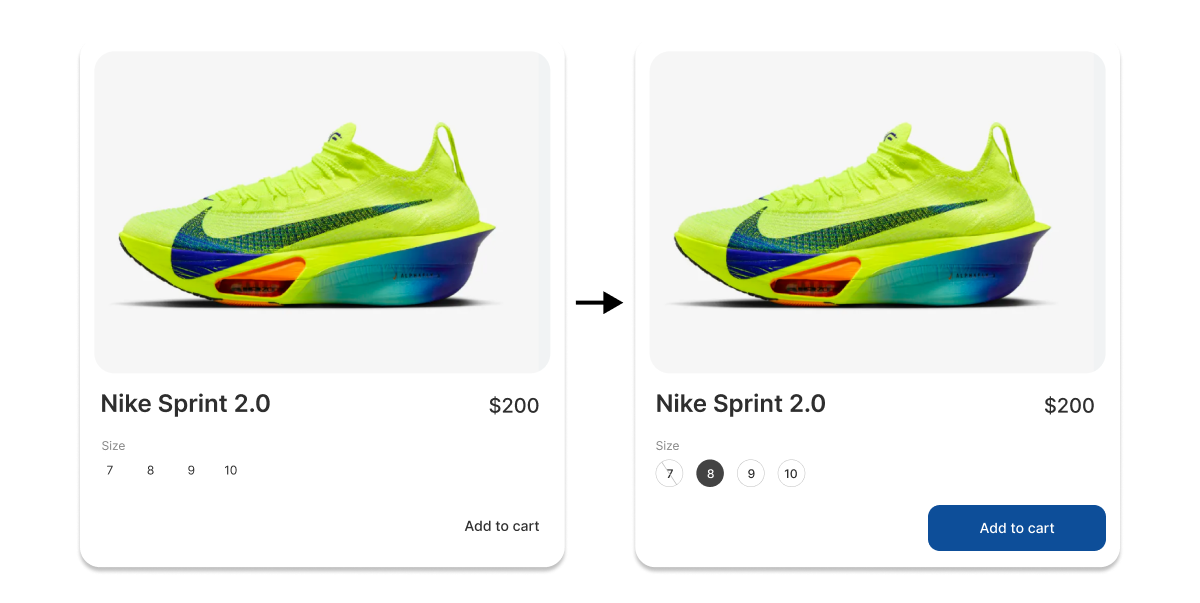
Here, the add to cart button has been highlighted using a different color from the rest of the interface. Additionally, to indicate that a size should be selected, the values have been circled.
Conclusion
In summary, this article demonstrates that user interface design is a crucial element in website development, directly influencing user experience. The principles of visual hierarchy, use of space, “Z”-shaped layout, and clear interactive elements are not just aesthetic recommendations, but functional necessities that facilitate navigation and improve the efficiency of interaction for users.
Implementing these rules can turn a poor interface into a great user experience. As exemplified by industry giants such as Apple, Google, and Facebook, continued investment in UI design is essential to remaining competitive. For designers, it is crucial to understand and apply these basic principles to create intuitive and engaging interfaces that meet user needs while providing a pleasant and efficient experience.
- ui